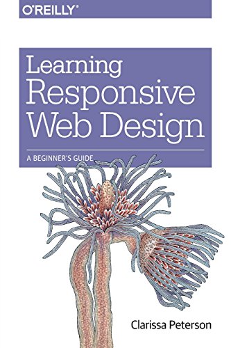
Inhaltsangabe
Deliver an optimal user experience to all devices--including tablets, smartphones, feature phones, laptops, and large screens--by learning the basics of responsive web design. In this hands-on guide, UX designer Clarissa Peterson explains how responsive web design works, and takes you through a responsive workflow from project kickoff to site launch.
Ideal for anyone involved in the process of creating websites--not just developers--this book teaches you fundamental strategies and techniques for using HTML and CSS to design websites that not only adapt to any screen size, but also use progressive enhancement to provide a better user experience based on device capabilities such as touchscreens and retina displays.
- Start with content strategy before creating a visual design
- Learn why your default design should be for the narrowest screens
- Explore the HTML elements and CSS properties essential for responsive web design
- Use media queries to display different CSS styles based on a device's viewport width
- Handle elements such as images, typography, and navigation
- Use performance optimization techniques to make your site lighter and faster
Die Inhaltsangabe kann sich auf eine andere Ausgabe dieses Titels beziehen.
�ber die Autorin bzw. den Autor
Clarissa Peterson is a UX designer and web developer, and co-founder of Peterson/Kandy, a Montreal-based digital consultancy specializing in creating responsive websites.
She frequently speaks and gives workshops on responsive design, mobile strategy, and user experience.
��ber diesen Titel� kann sich auf eine andere Ausgabe dieses Titels beziehen.
Weitere beliebte Ausgaben desselben Titels
Suchergebnisse f�r Learning Responsive Web Design: A Beginner's Guide
Learning Responsive Web Design: A Beginner's Guide
Anbieter: World of Books (was SecondSale), Montgomery, IL, USA
Zustand: Good. Item in good condition. Textbooks may not include supplemental items i.e. CDs, access codes etc. Artikel-Nr. 00100095439
Gebraucht kaufen
Versand innerhalb von USA
Anzahl: 1 verf�gbar
Learning Responsive Web Design: A Beginner's Guide
Anbieter: ThriftBooks-Atlanta, AUSTELL, GA, USA
Paperback. Zustand: Good. No Jacket. Former library book; Pages can have notes/highlighting. Spine may show signs of wear. ~ ThriftBooks: Read More, Spend Less. Artikel-Nr. G144936294XI3N10
Gebraucht kaufen
Versand innerhalb von USA
Anzahl: 1 verf�gbar
Learning Responsive Web Design: A Beginner's Guide
Anbieter: ThriftBooks-Reno, Reno, NV, USA
Paperback. Zustand: Good. No Jacket. Former library book; Pages can have notes/highlighting. Spine may show signs of wear. ~ ThriftBooks: Read More, Spend Less. Artikel-Nr. G144936294XI3N10
Gebraucht kaufen
Versand innerhalb von USA
Anzahl: 1 verf�gbar
Learning Responsive Web Design: A Beginner's Guide
Anbieter: ThriftBooks-Atlanta, AUSTELL, GA, USA
Paperback. Zustand: Fair. No Jacket. Readable copy. Pages may have considerable notes/highlighting. ~ ThriftBooks: Read More, Spend Less. Artikel-Nr. G144936294XI5N00
Gebraucht kaufen
Versand innerhalb von USA
Anzahl: 1 verf�gbar
Learning Responsive Web Design: A Beginner's Guide
Anbieter: ThriftBooks-Dallas, Dallas, TX, USA
Paperback. Zustand: Good. No Jacket. Former library book; Pages can have notes/highlighting. Spine may show signs of wear. ~ ThriftBooks: Read More, Spend Less. Artikel-Nr. G144936294XI3N10
Gebraucht kaufen
Versand innerhalb von USA
Anzahl: 1 verf�gbar
Learning Responsive Web Design : A Beginner's Guide
Anbieter: Better World Books, Mishawaka, IN, USA
Zustand: Very Good. 1st Edition. Former library copy. Pages intact with possible writing/highlighting. Binding strong with minor wear. Dust jackets/supplements may not be included. Includes library markings. Stock photo provided. Product includes identifying sticker. Better World Books: Buy Books. Do Good. Artikel-Nr. 12801352-75
Gebraucht kaufen
Versand innerhalb von USA
Anzahl: 1 verf�gbar
Learning Responsive Web Design : A Beginner's Guide
Anbieter: Better World Books: West, Reno, NV, USA
Zustand: Very Good. 1st Edition. Former library copy. Pages intact with possible writing/highlighting. Binding strong with minor wear. Dust jackets/supplements may not be included. Includes library markings. Stock photo provided. Product includes identifying sticker. Better World Books: Buy Books. Do Good. Artikel-Nr. 12801352-75
Gebraucht kaufen
Versand innerhalb von USA
Anzahl: 1 verf�gbar
Learning Responsive Web Design : A Beginner's Guide
Anbieter: Better World Books, Mishawaka, IN, USA
Zustand: Good. 1st Edition. Former library copy. Pages intact with minimal writing/highlighting. The binding may be loose and creased. Dust jackets/supplements are not included. Includes library markings. Stock photo provided. Product includes identifying sticker. Better World Books: Buy Books. Do Good. Artikel-Nr. 12940926-75
Gebraucht kaufen
Versand innerhalb von USA
Anzahl: 1 verf�gbar
Learning Responsive Web Design: A Beginner's Guide
Anbieter: WorldofBooks, Goring-By-Sea, WS, Vereinigtes K�nigreich
Paperback. Zustand: Very Good. The book has been read, but is in excellent condition. Pages are intact and not marred by notes or highlighting. The spine remains undamaged. Artikel-Nr. GOR006842691
Gebraucht kaufen
Versand von Vereinigtes K�nigreich nach USA
Anzahl: 2 verf�gbar
Learning Responsive Web Design: A Beginner's Guide
Anbieter: AwesomeBooks, Wallingford, Vereinigtes K�nigreich
Paperback. Zustand: Very Good. Learning Responsive Web Design: A Beginner's Guide This book is in very good condition and will be shipped within 24 hours of ordering. The cover may have some limited signs of wear but the pages are clean, intact and the spine remains undamaged. This book has clearly been well maintained and looked after thus far. Money back guarantee if you are not satisfied. See all our books here, order more than 1 book and get discounted shipping. Artikel-Nr. 7719-9781449362942
Gebraucht kaufen
Versand von Vereinigtes K�nigreich nach USA
Anzahl: 2 verf�gbar

![9789351106920: Learning Responsive Web Design : A Beginner's Guide (English) 1st Edition [Paperback] [Jan 01, 2014] Clarissa Peterson](http://assets.prod.abebookscdn.com/cdn/shared/images/common/loading/collections-spinner.gif)
